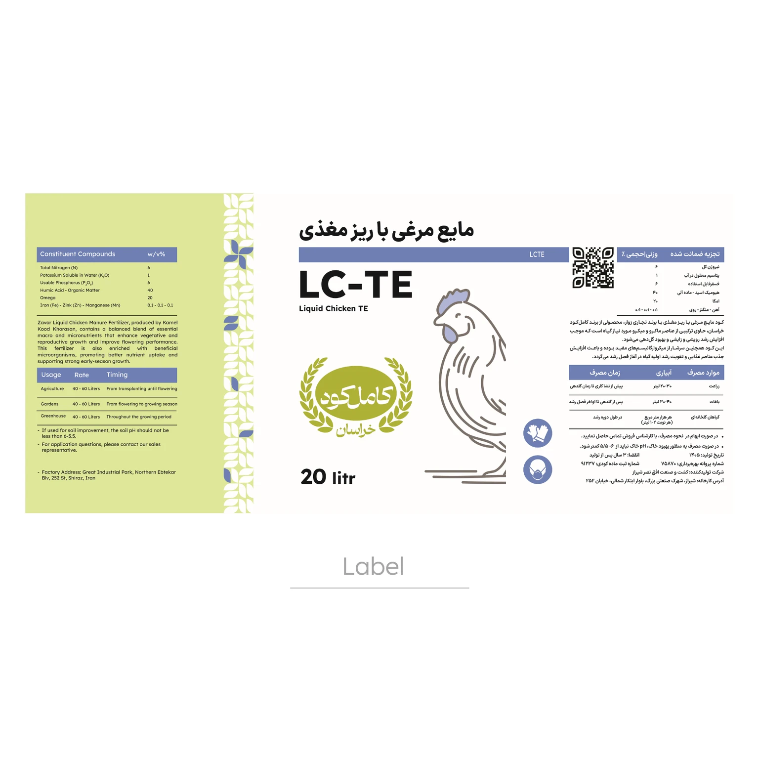
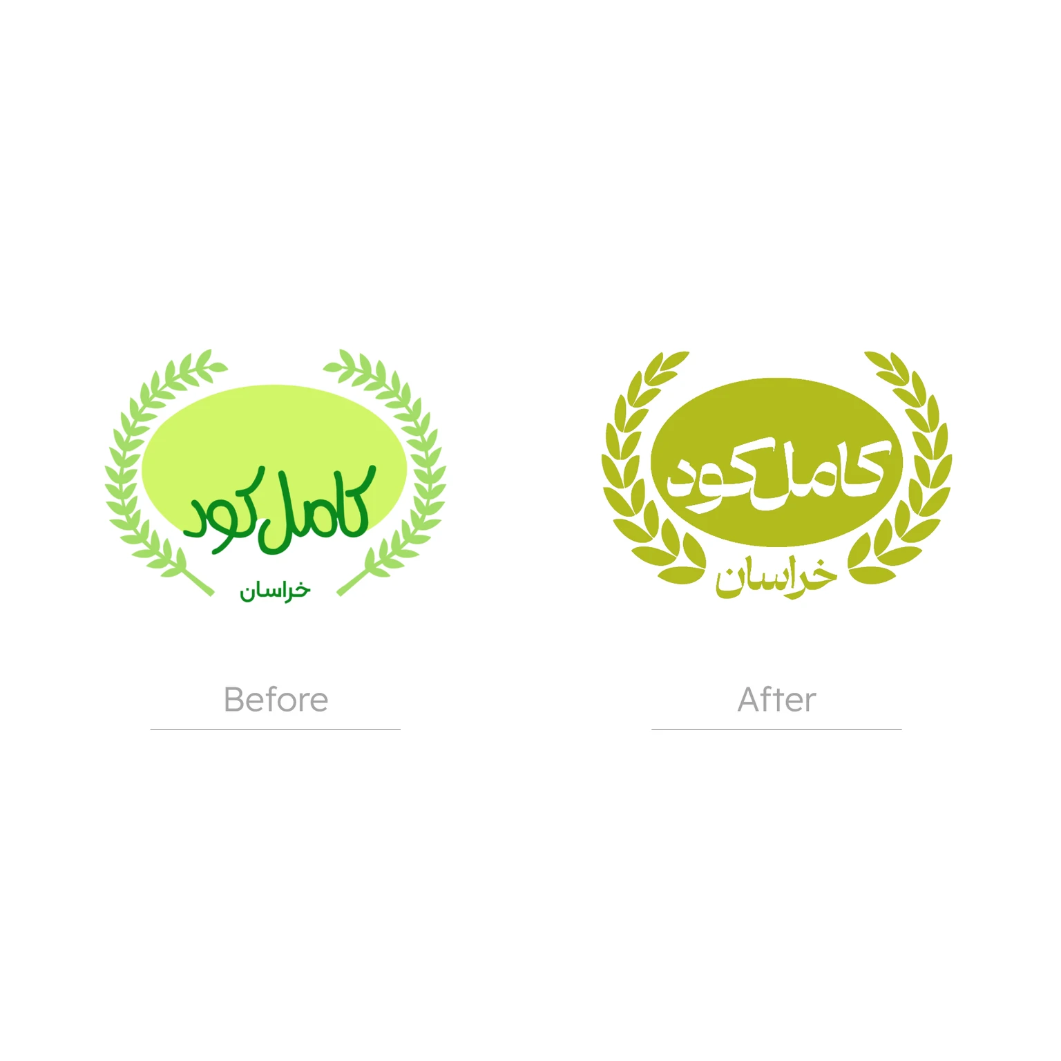
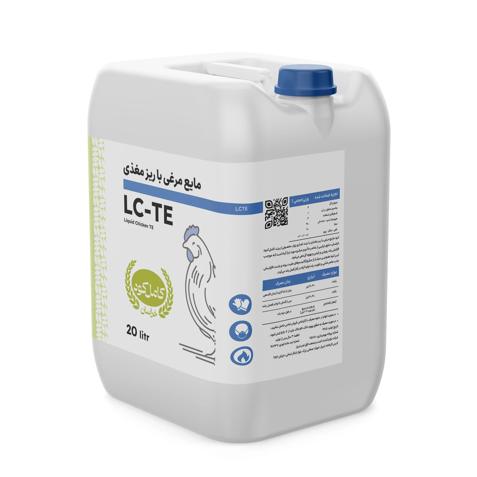
The rebranding project for Kamel Kod aimed to comprehensively redesign the brand identity and create a more professional, cohesive, and up-to-date image for this company active in agricultural fertilizer production. Given the breadth of products, the variety of brand touchpoints with audiences, and the importance of building trust in the agricultural inputs market, a full redesign of the brand identity was needed so the brand’s visual and communication language could better convey expertise, credibility, and consistency. In this project, the visual identity was thoroughly reviewed and elements such as corporate colors, typeface, icons, custom patterns, and the overall visual expression structure were designed and redefined. A set of communication and executional assets — including website, letterhead, business cards, brochures, catalogues, and labels for liquid and solid products — were also designed so the new identity would be implemented consistently across all touchpoints. Website design, as a key component of the project, was developed to provide a cohesive platform for presenting the brand, organizing product information, and strengthening Kamel Kod’s digital presence so the brand’s connection with audiences and the target market online would continue with the same quality and unity as the new identity. This collaboration ultimately resulted in a cohesive and practical visual and communication identity system for Kamel Kod; a system that, in addition to elevating the brand’s presentation quality, creates a stronger foundation for professional product showcasing, marketing communications development, and reinforcing the company’s position in the market.